They were already good enough for HSBC. The website was not saying so.
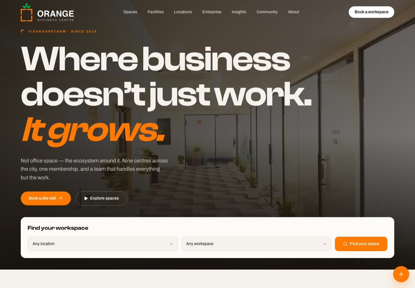
Orange Business Centre runs nine managed workspaces in Visakhapatnam, with tenants like Kotak Mahindra Bank, HSBC and Chegg. Their old site made them look like a local desk rental. I rebuilt the brand and the site to match the quality of the actual product and to turn browsing into booked site visits.
The gap between the product and the impression
This was an unusual starting point. Most rebrand projects begin with a business that needs to improve. Here the business was already strong. Nine centres in the best parts of the city, enterprise tenants, forty amenities as standard, and a facilities management arm they were adding.
The website simply did not carry any of that. It read like a commodity listing, which creates a specific commercial problem: if you look cheap, you get haggled, and enterprise procurement teams quietly filter you out before a conversation happens.
There was also a structural problem. Nine locations multiplied by six space types is a lot of combinations, and the old site left visitors to work out the maze themselves. Someone who wants a private cabin for six people near Beach Road should not have to compare nine pages to find it.
Stop selling square feet. Sell the ecosystem around the desk, because that is the part competitors cannot copy quickly.
What I changed
The strategy showed up in the language first. Instead of listing rentable units, the site leads with what the business actually provides. Lines like we do not rent office space, we build ecosystems and where business does not just work, it grows reframe the same product as infrastructure for a growing company.
Then I made the practical decisions match that promise:
Lead with the enterprise logos
Kotak, HSBC, Chegg and Anand Rathi answer the trust question faster than any adjective. If serious companies already sit here, a smaller company stops worrying.
Publish the pricing
Flexible workspace is full of quote on request. Showing all inclusive monthly memberships with no long lock in turns price from a source of suspicion into a selling point.
Organise by need, not by building
Visitors choose a space type first, then a location. That matches how someone actually shops for an office and collapses the nine by six maze into two easy steps.
Make the call to action a visit, not a form
Nobody signs an office lease online. The real conversion is walking through the door, so booking a site visit became the primary action, with WhatsApp as the low friction alternative.
The small things that carry premium
Premium in a B2B website is rarely one big move. It is an accumulation of small ones, and most of them are about respect for the reader's time.
- Generous whitespace and one idea per section, so nothing feels like it is shouting for attention.
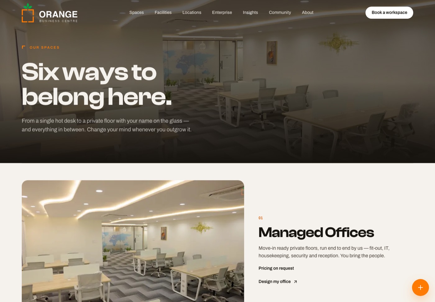
- Real photography only. No stock images of people laughing at laptops, because a prospective tenant is trying to judge an actual room.
- Specific claims instead of adjectives. Gigabit wifi, power backup, biometric entry, twenty four hour access, move in within days. Concrete beats "world class".
- An insights section about flexible work and the city's business growth, which quietly positions them as people who understand the market, not just landlords.
The facilities management arm was the interesting late addition. It could easily have looked like an unrelated service bolted on. Framed as part of the ecosystem story, housekeeping, security and maintenance became evidence for the positioning rather than a distraction from it.
Where it stands, and what I would improve
The site is live at orangebusinesscentre.com, covering all nine centres, the six space types and the facilities management service.
No conversion numbers to show yet. The honest position is that I designed for a commercial goal and cannot yet prove the result. The measurement I would want is simple: site visits booked per month, and how many arrive already knowing which space they want.
What I would do differently
I would build a proper availability layer. Right now the site sells the idea of a space and a human confirms what is free. Showing genuine availability per centre would remove the one question that still forces a phone call, though it depends on the business keeping that data current, which is an operations commitment as much as a design one.
I would also test the pricing page against a version with a short qualifier first, team size and preferred area, to see whether a small amount of friction produces better quality enquiries. My instinct says transparency wins here, but that is a belief I would rather test than defend.