A friend's travel business was stuck. So I built him a company, not a website.
VayuGo sells curated international holidays out of India. What it needed was not a prettier homepage, it was a way to look credible to strangers and to answer enquiries fast enough to win them. I did the brand, the product design, the front end, the admin system and the deployment. It is live and taking enquiries.
The actual problem
A friend was running a travel business and struggling. When I looked at why, the website was only part of it.
Travel is a trust purchase. Someone is about to hand over a large amount of money for a honeymoon, months in advance, to a company they found online. Against big booking portals and established agencies, a small operator loses that comparison before anyone reads a word.
But the deeper problem was operational. Enquiries arrived by WhatsApp and phone. Every quote was assembled by hand each time, in a document, from scratch. That takes hours, and in travel the customer is usually talking to three companies at once. Slow reply, lost booking.
He did not need a website. He needed to look trustworthy in ten seconds, and to reply with a real proposal in minutes rather than days.
So I treated it as two problems: a credibility problem facing the customer, and a speed problem facing the business.
Solving credibility with brand
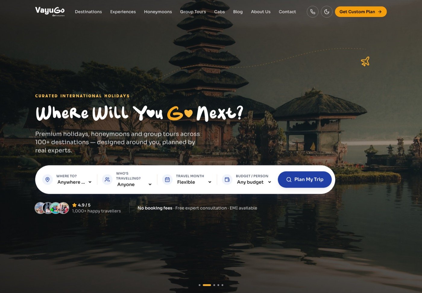
Big travel portals all look the same: dense, transactional, blue. Competing with them on their own visual terms would have made VayuGo look like a worse version of a bigger thing.
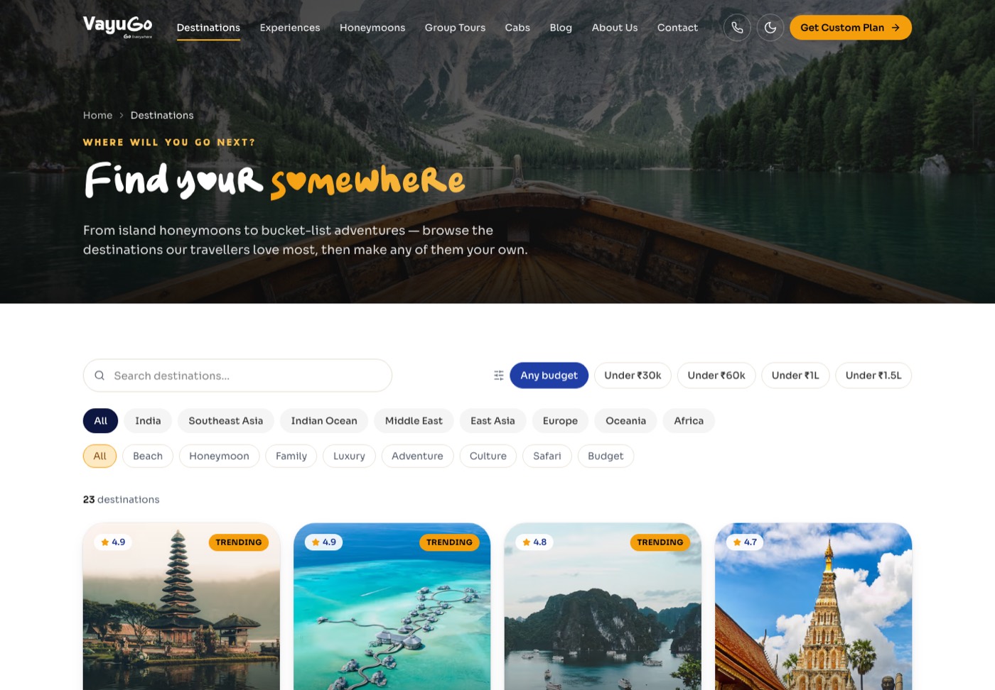
I went the other way. The wordmark is hand drawn and a little imperfect, which reads as a person rather than a call centre. Photography is large and uncropped. The tone across the site is a human one, "Where will you go next", not "Search deals now".
Then I made the trust signals concrete rather than decorative: real customer photos and reels, named bylines on stories, plain statements like no booking fees and free consultation. The line I kept coming back to was travel planned by people, perfected for you, because the human part is the only advantage a small operator actually has.
The website was never the bottleneck. The bottleneck was the hours between an enquiry and a proposal, so that is what I designed the back office around.
Solving speed with the admin system
Most of the work people cannot see went here. I built a full CMS and lead system so the business runs without me:
- Leads CRM. Every enquiry from the site lands in one place, with export, instead of scattering across WhatsApp threads.
- Tour builder to proposal. Staff assemble a tour once, then turn it into a shareable client proposal with a link and a print view. This is the piece that turns hours into minutes.
- Content without a developer. Destinations, experiences, tours, blogs, reels and customer stories are all editable, with image uploads and autosave.
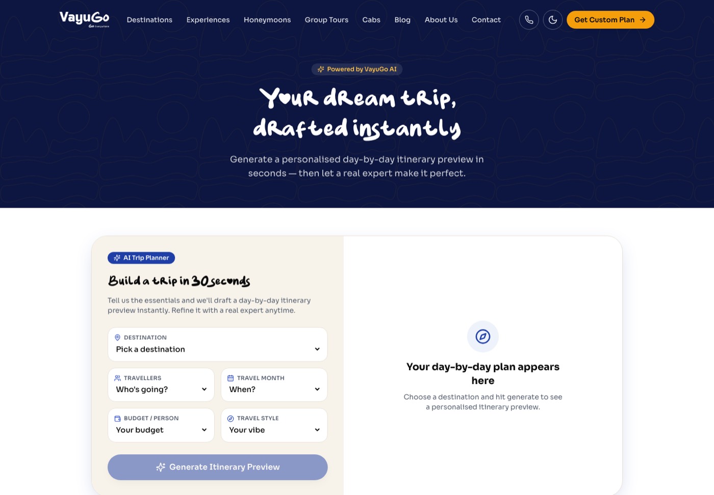
- An AI trip planner on the public site that turns a destination, month, budget and travel style into a day by day outline in seconds. It is a conversation starter, not a booking engine, and it is honest about that.
Building and running it
I built the site on Next.js 16 with TypeScript and Tailwind, with SQLite behind the CMS. I also pulled the interface pieces into a small internal design system package so the marketing site and the admin tools stay consistent as things grow.
Because this is someone's business rather than a portfolio piece, the unglamorous parts mattered:
- Self hosted on a VPS behind a reverse proxy, run under PM2 with zero downtime reloads, so a deploy never drops a visitor mid enquiry.
- A safe upgrade path for the live database, since real customer content was already in it by the time later features shipped.
- SEO structure and schema for a business that lives or dies on being found, plus WhatsApp and call buttons everywhere, because that is how Indian customers actually get in touch.
I used Claude Code heavily throughout. It is why one person could cover brand, front end, CMS and deployment in a sensible amount of time. What I would not claim is that it did the thinking. The decisions that made this work, competing on humanity rather than scale, and attacking proposal speed rather than page design, came from watching how the business actually loses customers.
Where it stands
VayuGo is live at vayugo.co and running as a working business. Enquiries come through the site, staff manage content and leads themselves, and proposals go out from the tour builder.
On numbers. I am not publishing traffic or booking figures here, partly because they are the client's and partly because I would rather show the system than quote a number I cannot evidence. What I can point at is the thing itself, live, in use, and maintained.
What I would do next
The obvious gap is measurement. I would instrument the funnel properly: where enquiries drop, how long a proposal actually takes now against the old way, and which destination pages bring people who convert. Right now I have a strong story about the bottleneck and no dashboard proving I fixed it, and I would like the dashboard.
After that, the customer portal. It exists as a shell for trip documents, visa status and payments. Finishing it would move VayuGo from selling a trip to holding the whole relationship, which is where repeat business lives.